Technical Analysis Made Simple
This short guide is for those who want to master technical analysis with outs pending too much time on it.
First things first, let’s define what we are talking about. Technical analysis is there search of price history. The idea behind technical analysis is that history always repeats it self. Analysts believe things that happened in the past would repeat in the future.
Two types of technical analysis
Chart analysis
We draw support and resistance lines, review chart patterns, etc. The main advantage of chart analysis is its simplicity. However, there is ad is advantage: the human factor is essential here as analysts can interpret a single chart differently.
Mathematical analysis
This type uses technical indicators—the lines calculated based on various formulas depending on price. Here, the human factor is irrelevant since all the analysts will see the same picture based on the same indicators. The disadvantage is the huge number (more than 300) of indicators, which makes it challenging to master all of them.
Let’s begin with the chart analysis and the concepts you need to know to understand it.
Chart analysis
1. Support and resistance lines
These lines represent the values where the
price bounces back and starts moving in the
opposite direction. The analysts draw them
to know where the price reversal will happen.

This is a real-life example of a price moving up and down. The two parallel lines help us understand where the price will reverse.
What happens if everything goes as planned? The price will move down from the resistance line.
The support and resistance
lines might be inclined.
Here, the situation is exactly the same, but the price direction differs.
Let’s consider the price again. Where will it go? Yes, exactly as predicted!
Learn more
2. Simple Patterns
Let’s discuss some simple traditional patterns in chart analysis. A price tends to form a pattern, and some of such patterns tend to repeat.
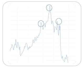
Head and shoulders
You can see three tops on the chart here, with the one in the middle higher than the others. If you see the head and shoulders pattern on a chart, you should expect the price to change the direction.
On this chart, the head and shoulders pattern warned about further price falls.
Learn more
Double top
The same is true for the double top pattern
Remember that real-life charts may not look exactly like these perfect patterns. For example, you should not expect the patterns to always form a perfect symmetry. You’ve seen the two most popular patterns used in chart analyses, but there are plenty of others, such as reversal head and shoulders, double bottom, flag, or pennant.
Learn more
3. Japanese Candlesticks
The Japanese actually invented their own approach to chart type
for financial analysis — the Japanese candlesticks.
Let’s discuss one of the most important candlestick patterns –
the engulfing candle.
You can see two candlesticks: a red and a green one. The second candlestick’s body should be larger than the first one: it engulfs the first candlestick’s body. In this case, the price direction might change. Note that the lines on the top and the bottom of the candlesticks (the tails) have no significance.
The price had been rising on this chart until the engulfing pattern emerged. The second red candlestick covered the green one, and the price dropped.
Learn more
Mathematical Analysis
You are now ready for mathematical analysis. All the charts here are based on the We will cover a few of the most popular indicators: default platform settings, but you can
always customize them as needed.
- Moving averages
- MACD
- RSI
- Stochastic
This is the simplest indicator. It is calculated as the average of the price and represents a line.
The black line on this chart is the moving average.
How do we use it?
- This is the overall price movement. If the line goes down, opening sell trades is better, and vice versa.
- The line shows an appropriate moment to buy or sell. You should buy if the price breaks above the moving average up (green arrow) or sell otherwise (red arrow):
2. MACD
We won’t discuss how the indicator is calculated: it is sufficient to know that it allows us to assess the strength of price movement in a market.
The indicator consists of the MACD histogram and the MACD line. >>>>>
MACD suggests to open the trades as follows:
- When MACD lines go up, you should open buy positions and vice versa.
- If the MACD histogram rises, trade up (trade down otherwise).
The situation is a little more complicated if we look at the intersection of the lines:
The one moving faster is the MACD line, and the smoother one is the signal line. When the MACD line breaks the slow line moving up, it is time to open buy positions (and otherwise)
Learn more
3. RSI
Relative Strength Index (RSI) is one of the most popular indicators with traders. The indicator consists of a line that moves between two zones: overbought (upper zone) and oversold (lower one).
A trader gets a signal to open a trade when the indicator returns to its regular working zone:
- If the line breaks the upper line going down, i. e.it returns from the overbought zone, it is time to open a sell position.
- When the RSI line crosses the lower line and heads up (returns from the oversold zone), the time is for a Buy trade.
Learn more
4. Stochastic
A stochastic also has two lines: the fast stochastic line and the slow stochastic line.
- If the fast line breaks the slow line down, you can open a sell position.
- If the fast line breaks the slow one up, you can open a buy position.
Remember that the lines should only intersect in the overbought and oversold zones.
Learn more
Conclusion
Keep in mind:
- Any indicator can give a false signal.
- Some indicators only apply to solid movements (MACD lines, simple moving average, etc.).
- Other indicators are more appropriate when there are no significant movements on the market (Stochastic oscillator, RSI, etc.).
- It is wise to use multiple indicators simultaneously, combining technical analysis with chart analysis.
- However, don’t use too many indicators: 2 or 3 should always be sufficient.
Test your knowledge
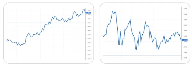
Find the support and resistance lines here:
Locate the double top pattern on the chart Find at least two engulfing patterns here:
below:
Locate the entry points on the chart below Find all the entry points using MACD (the blue
(the blue line is the price, and the red one is line is MACD, and the red line is signal).
the moving average).
Find all entry points using RSI. Use the stochastic to decide if you should buy or
sell.


0 Comments